Goal
I have been streaming music on Spotify since more than a decade. I wanted to see if there were any patterns to my streaming habits. Things like
- How many hours have I streamed (per day/month/year/week/week-day/week-end)
- What kind of music have I streamed (by artist/genre/track/track-length)
In order to see the pattern, I had to visualise it. The principle behind it is this:
People understand what they see
Because of the instant response of visualising data that is abstract and hard to interpret, Observable’s plot seemed to be the right playground. It is a ‘language’ used to talk to data and the more fluent and comfortable you are in a language, the more you can communicate and undertand and perceive. Javascript has always been my go to language, thus, this seemed comfortable.
Abstract form
Data in it’s raw form is abstract, like anything complex - hard to interpret and perceive at first. This is what my spotify data looked like, from spotify’s API
[
  {
    "ts": 1586699510000,
    "level_0": 1428,
    "index": 1428,
    "Unnamed: 0": 1428,
    "username": "kaizer1v",
    "platform": "iOS 13.3.1 (iPhone11,8)",
    "ms_played": 1207,
    "conn_country": "IN",
    "ip_addr_decrypted": "1.39.146.174",
    "user_agent_decrypted": "unknown",
    "master_metadata_track_name": "Runnin' Down A Dream",
    "master_metadata_album_artist_name": "Tom Petty",
    "master_metadata_album_album_name": "The Best Of Everything - The Definitive Career Spanning Hits Collection 1976-2016",
    "spotify_track_uri": "spotify:track:5yAu4njFSdM47dfsTkQPZ2",
    "episode_name": null,
    "episode_show_name": null,
    "spotify_episode_uri": null,
    "reason_start": "playbtn",
    "reason_end": "unexpected-exit-while-paused",
    "shuffle": false,
    "skipped": null,
    "offline": 0.0,
    "offline_timestamp": 1586367553238.0,
    "incognito_mode": 0.0,
    "city": null,
    "region": null,
    "metro_code": null,
    "longitude": null,
    "latitude": null,
    "year": 2020,
    "month": 4,
    "day": 12,
    "hour": 13,
    "minute": 51,
    "seconds": 50,
    "time": "13:51:50"
  },
  // ...
]
When exploring the data by interacting with it, there are elements of surprise or questions that arise. Here I am trying to understand my listening pattern during the 24 hours of the day. I was curious to know what songs I listened to after midnight until early mornings and on which days were these?
Streaming during the time of the day


The highlighted circles are the top artists being played, which contain the following based on the total number of hours I have listened to them

The visual
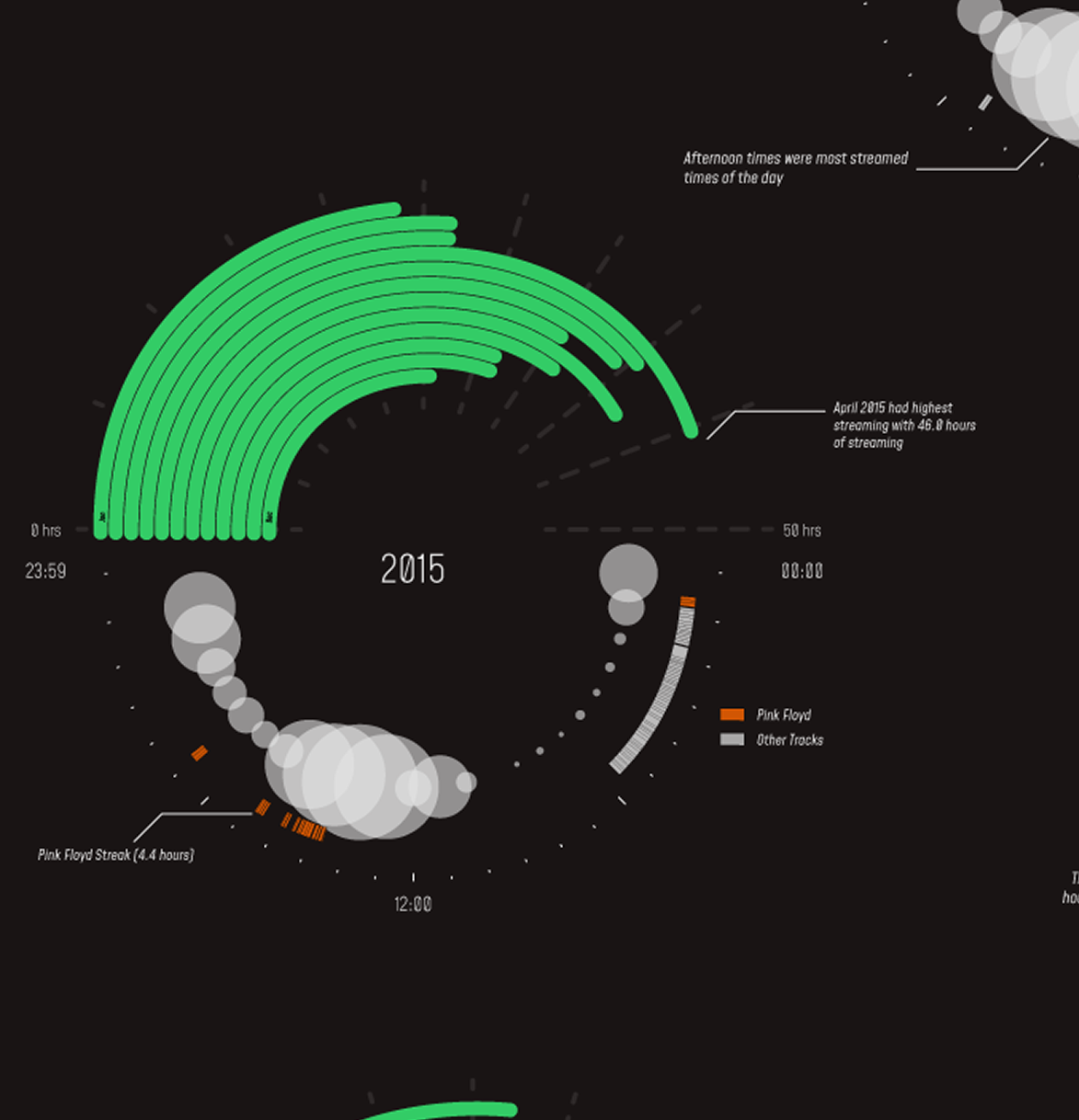
Finally I created a visual to communicate stream time and artists. Tried to incorporate Spotify brand’s colours and style into the visual
You can view my entire analysis on observable. You can view the illustrated version on behance. Github repository for the same here too